 > English > Climate Encyclopaedia > Food and Climate > more > 3. Drought in the Mediterranean > * Worksheet 1
|
|
|
|
|
Food & ClimateMore |
|
|
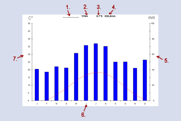
Climate diagrams are important sources of information on precipitation amounts and temperatures at a particular location.
|
|
The climate is the average weather conditions seen at a particular location. The climate, therefore, can't be observed directly. We need at least 30 years of data to determine the average climate. A climate diagram is the best way to visualise climate data. The climate diagram shown above is called a Walter Lieth diagram. On Walter Lieth diagrams 10°C on the temperature scale always correspond to 20 mm of rain on the precipitation scale. In the diagram precipitation (rainfall) is also often shown using one line instead of 12 columns. Arid and humid months can be directly read off. Arid months are months when the temperature line is higher than the precipitation line. These months are dry. The diagram above has no arid months. Humid months are months when the precipitation line is higher than the temperature line. All the months on the diagram above are humid. Climate diagrams can also be shown in different formats, for example, as circle diagrams.
Using the following data, draw your own climate diagram for Barcelona. Instructions: - Use graph paper
|
Barcelona (175 m / 574 feet above sea level)
|
||||||||||||||||||||||||||||||||||||||||||||||||||||||||||||||||||||||||||||||||||||||||
|
Have a look at the site: www.worldclimate.com Find your home town or somewhere close to it and use the data on the web page to draw a climate diagram for where you live.
Collect your own data and draw a simple climate diagramWhat you will need: Measure the temperature and the amount of precipitation once a day at the same time each day (e.g. 13.00 hours) for one week and record the data in the table.
|
|
|
Remember:
|
 |
|
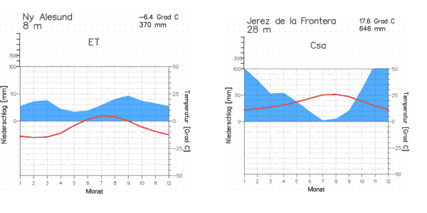
2. Climate diagrams for Ny Alesund and Jerez de la Frontera. Author: Dipl. Met. Bernhard Mühr, Institute for Meteorology and Climate Science, University of Karlsruhe. Source: www.klimadiagramme.de
|
About this page:author: Sarah Ancot - University of Nürnberg, Nürnberg, Germany
|

