espere ESPERE-ENC working area - preliminary unevaluated websitesEnvironmental Science Published for Everyobody Round the Earth
Printer friendly version of this page
[Master Home]    English Sitemap    [Master Sitemap]    www.espere.net   
Food & Climate
basics
more
1. Past and present
2. Predicting the future
3. Drought in the Mediterranean
- importance of drought
- drought driving factors
- drought management
* Worksheet 1
* Worksheet 2
* Worksheet 3
WS: Linklist


Download


Food & Climate 

More

Worksheet: Drought in the Mediterranean

Sheet 1: Climate diagrams


basicsmore
basicsmore
basicsmore
basicsmore
basicsmore
basicsmore
basicsmore
basicsmore


Climate diagrams are important sources to gain quick and clear information about precipitation and temperature at a certain place / region.


diagram by Julia Heres

Explanation of the diagram:

1. name of place / city
2. height above sea level
3. average annual temperature
4. average annual percipitation
5. Percipitation in mm
6. name of months
7. temperature in °C


> corrected  >

The climate is the average weather conditions seen at a particular location.  The climate, therefore, can't be observed directly.   We need at least 30 years of data to determine the average climate.

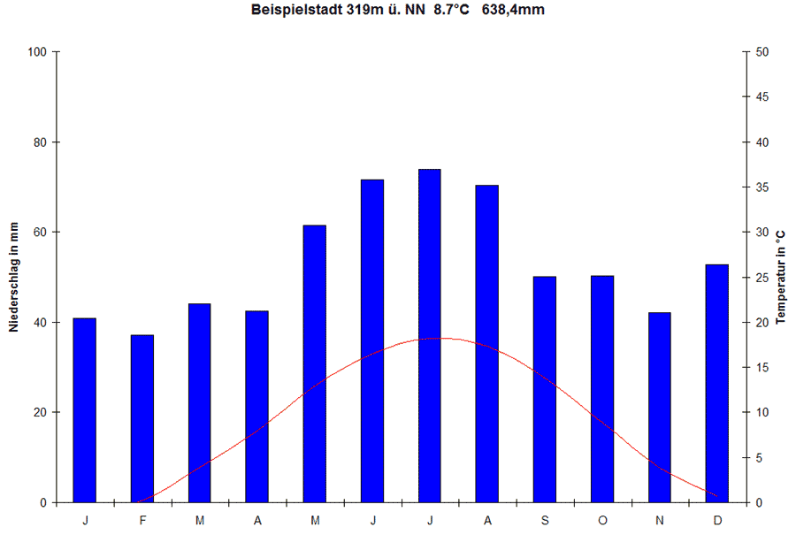
A climate diagram is the best way to visualise climate data.  The climate diagram shown above is called a Walter Lieth diagram.

On Walter Lieth diagrams 10°C on the temperature scale always correspond to 20 mm of rain on the precipitation scale. In the diagram precipitation (rainfall) is also often shown using one line instead of 12 columns. Arid and humid months can be directly read off. 

Arid months are months when the temperature line is higher than the precipitation line. These months are dry. The diagram above has no arid months.

Humid months are months when the precipitation line is higher than the temperature line.  All the months on the diagram above are humid.

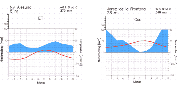
Climate diagrams can also be shown in different formats, for example, as circle diagrams.

<<

With the help of the following data you can draw your own climate diagram of Barcelona:

Instruction for drawing:

- Use graph paper
- First draw the axis of the months. 5 mm represent 1 month.
- Then draw 2 y-axis. Attention: 1 cm represents 10°C at the temperature axis and 20 mm at the precipitation axis.
- Transfer the temperature data in the diagram and connect them with one line. Use the red colour.
- Transfer the precipitation data in the diagram and connect them with one line or draw 12 separate columns. Use the blue colour.


Barcelona (175m / 574 feet)


Jan

Feb

Mar

Apr

May

Jun

Jul

Aug

Sept

Oct

Nov

Dec

year

°C

9.1

10.3

11.8

14.1

17.4

21.2

24.2

24.1

21.6

17.5

13.1

9.9

16.2

mm

38.0

37.5

47.0

47.2

43.8

37.7

27.5

43.8

76.3

96.2

51.2

43.7

590


°F

48.4

50.5

53.2

57.4

63.3

70.2

75.6

75.4

70.9

63.5

55.6

49.8

61.2

inch

1.5

1.5

1.9

1.9

1.7

1.5

1.1

1.7

3.0

3.8

2.0

1.7

23.2


Have a look and visit this site: www.worldclimate.com . Maybe you can find your hometown and draw a climate diagram with those data.


Collect your own data and draw a climate diagram

What you need:
- thermometer
- rain meter

Take the temperature and the amount of precipitation once a day at the same time (e.g. 13.00 hours) for 1 week and enlist the data in the table.


Day

1

2

3

4

5

6

7

°C


mm


You can also draw a "climate diagram" with these data.


But remember:
This "climate diagram" only represents the data of one week.
But to understand the formation of a climate diagram this is still a good exercise.

But if you want to compare the climate of different regions,
you must use the average monthly data, which have been measured over many years.


Comparison of two climate diagrams:

Print out the worksheet below and try to answer the questions.


Climate diagrams of Ny Alesund and Jerez de la Frontera, author: Dipl. Met. Bernhard Mühr, institute for meteorology and climate science, university of Karlsruhe, source: www.klimadiagramme.de


About this page:

- Author: S. Ancot - University of Nürnberg - Germany
- scientific reviewing:
- educational reviewing: Dr. Schrettenbrunner / J. Heres
- last update: 16.09.03


 top

ESPERE / ACCENT

last updated 14.09.2005 11:43:00 | © ESPERE-ENC 2003 - 2013