1. Read the tell-tale map!
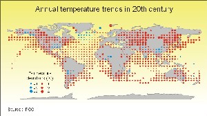
a) Look at the diagram - it shows temperature changes during the last 100 years on different areas of the globe.
In which areas has the temperature increased the most? Are there places where the temperature has decreased? Which consequences might the changes have for people who live in the areas with the greatest increase or decrease? Why do you think there are areas on the map without symbols is it because the temperature is unchanged here, or may there be other reasons?
|
 |
 |
 |
|
Source: UNEP/GRID-Arendal, Norway (click to enlarge, 88 kB)
|
|


